In this post, we will have an overview of Nik logos. The origin of these designs is my last name, Nik Ghalb. Nik in Persian (Farsi) means good and nice, and Ghalb means heart. That's why in some designs I used the shape of heart, as an element of my last name. Let's have a look at what happened during the years of designing logos:
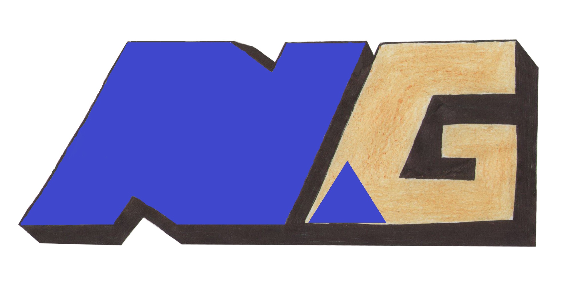
- NG Logo | The First Sketch - 2014
- Nikghalb Mark I | Original "NG Nikghalb" logo - 2015
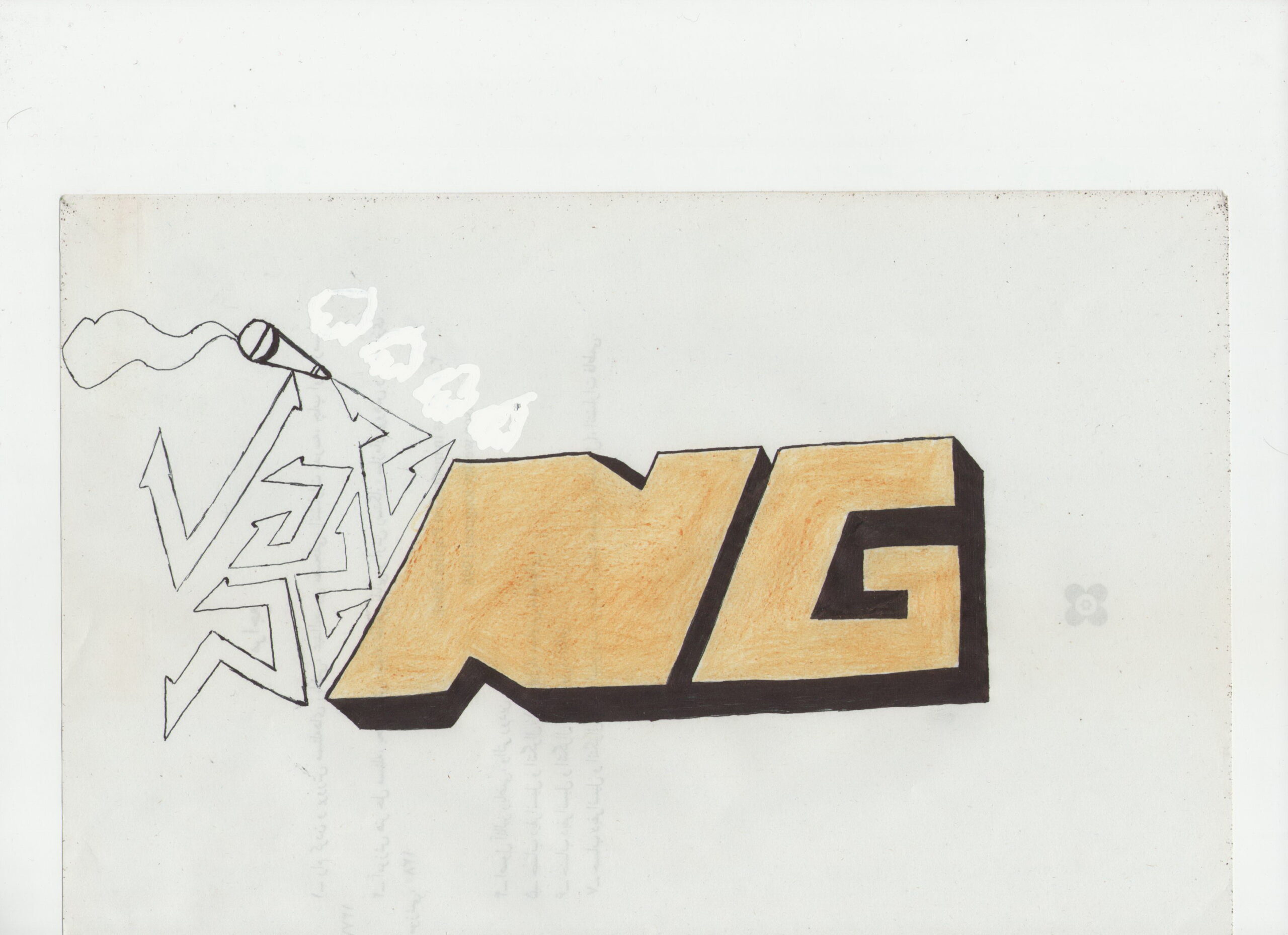
- NG Art | Inspiration for the 2023 NikArt - 2016
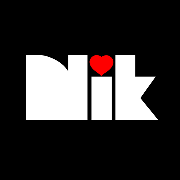
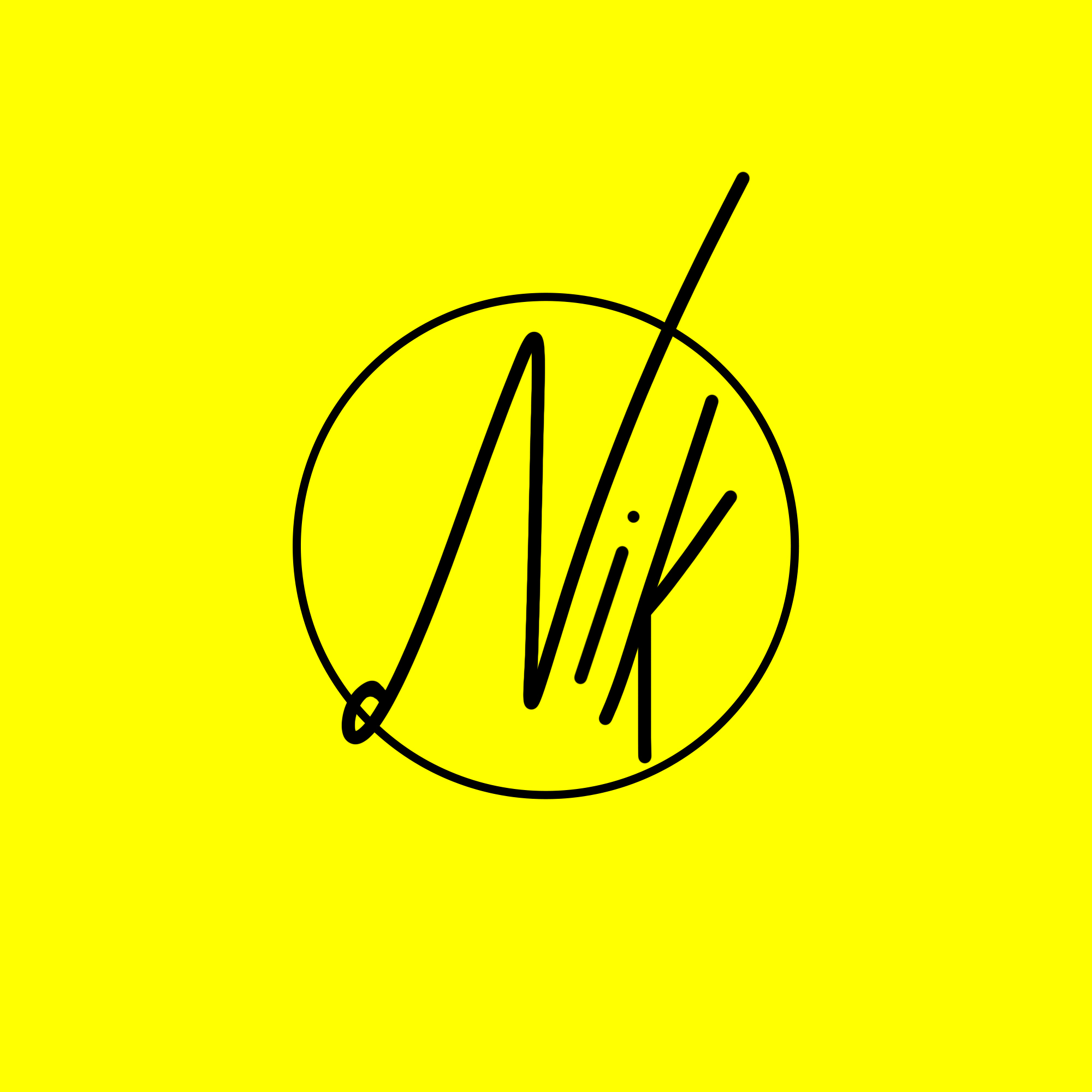
- Nikghalb Mark II | The one and only "Nik" logo, with a tiny heart (as I mentioned Ghalb means heart in Persian) as the dot for i, merging two words of Nik and Ghalb - 2016
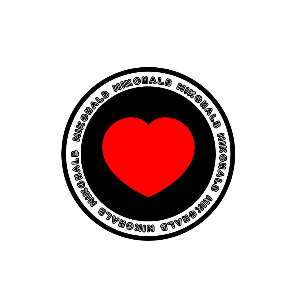
- Nikghalb Mark III | With the focus on heart (Ghalb) - 2018
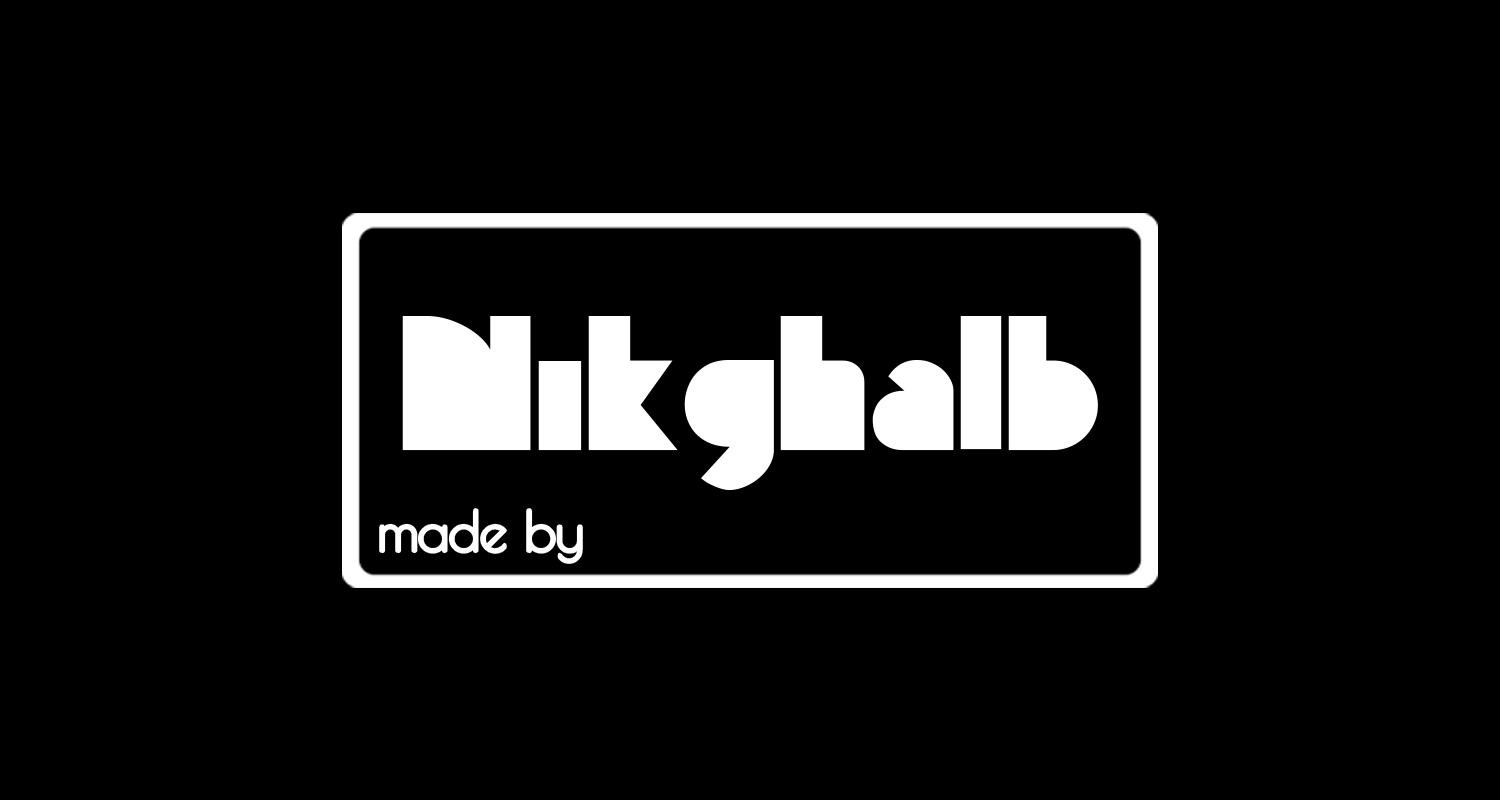
- made by NIKGHALB mark I | Inspired by Nikghalb Mark II logo, created for using in photographs - 2019
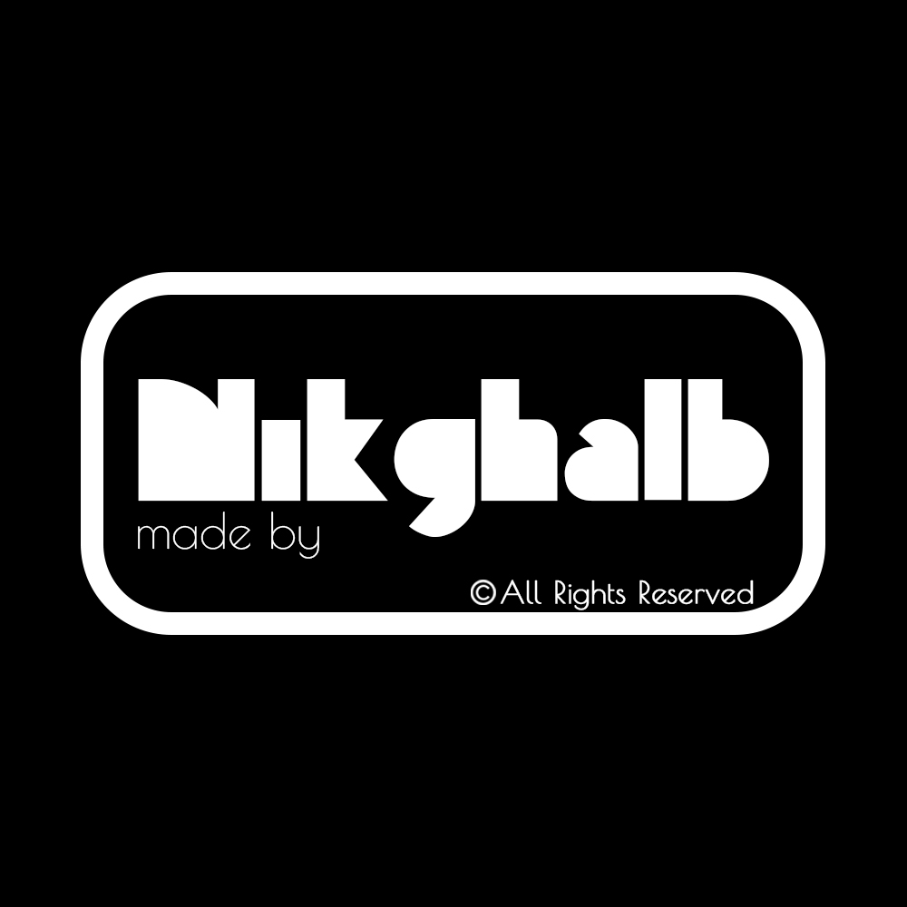
- made by NIKGHALB mark II | Tiny changes, improvement always matter - 2020
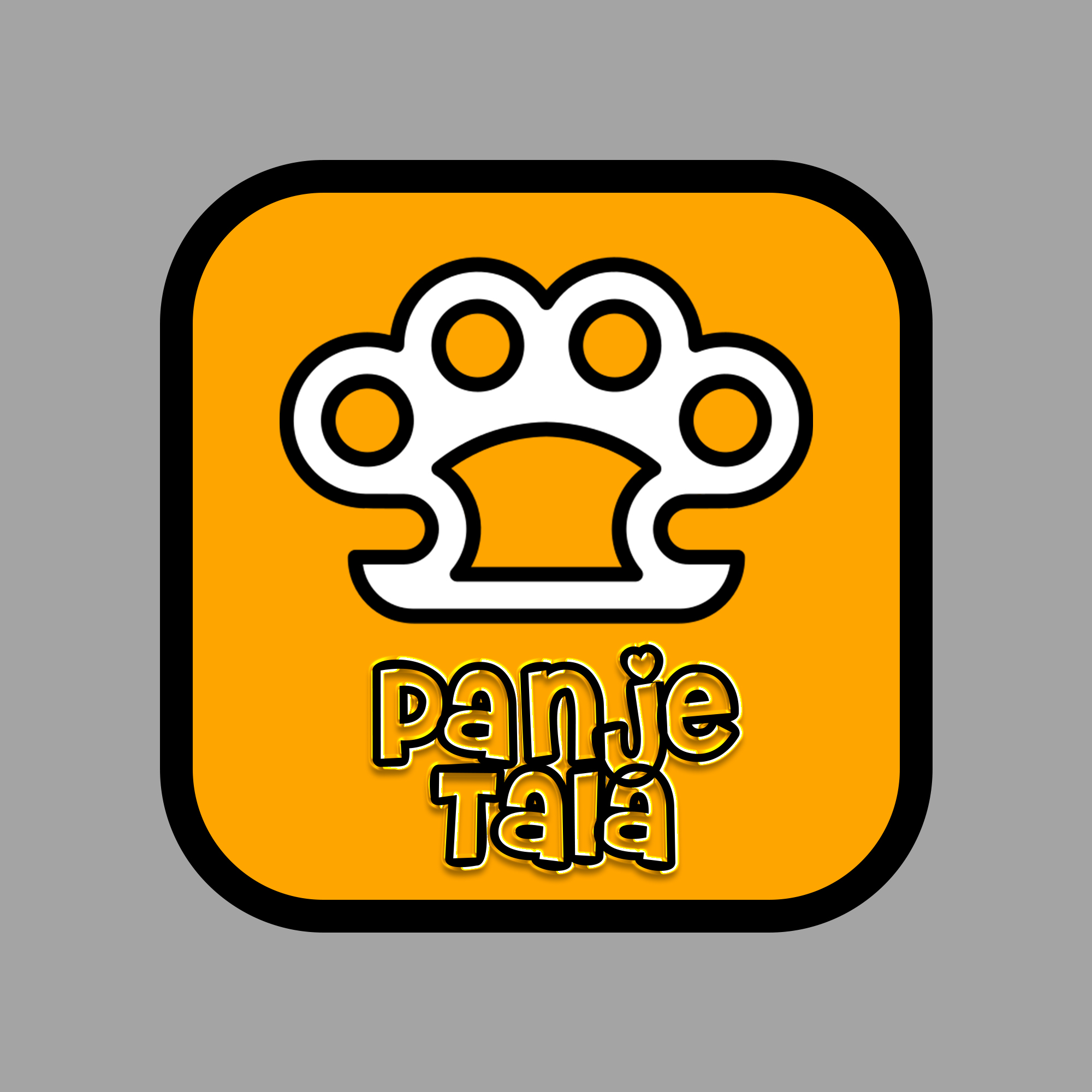
- PanjeTala | The official logo for fun and creative contents such as GTA Friends - 2020
- Nik. Simple, clean, minimal - 2021
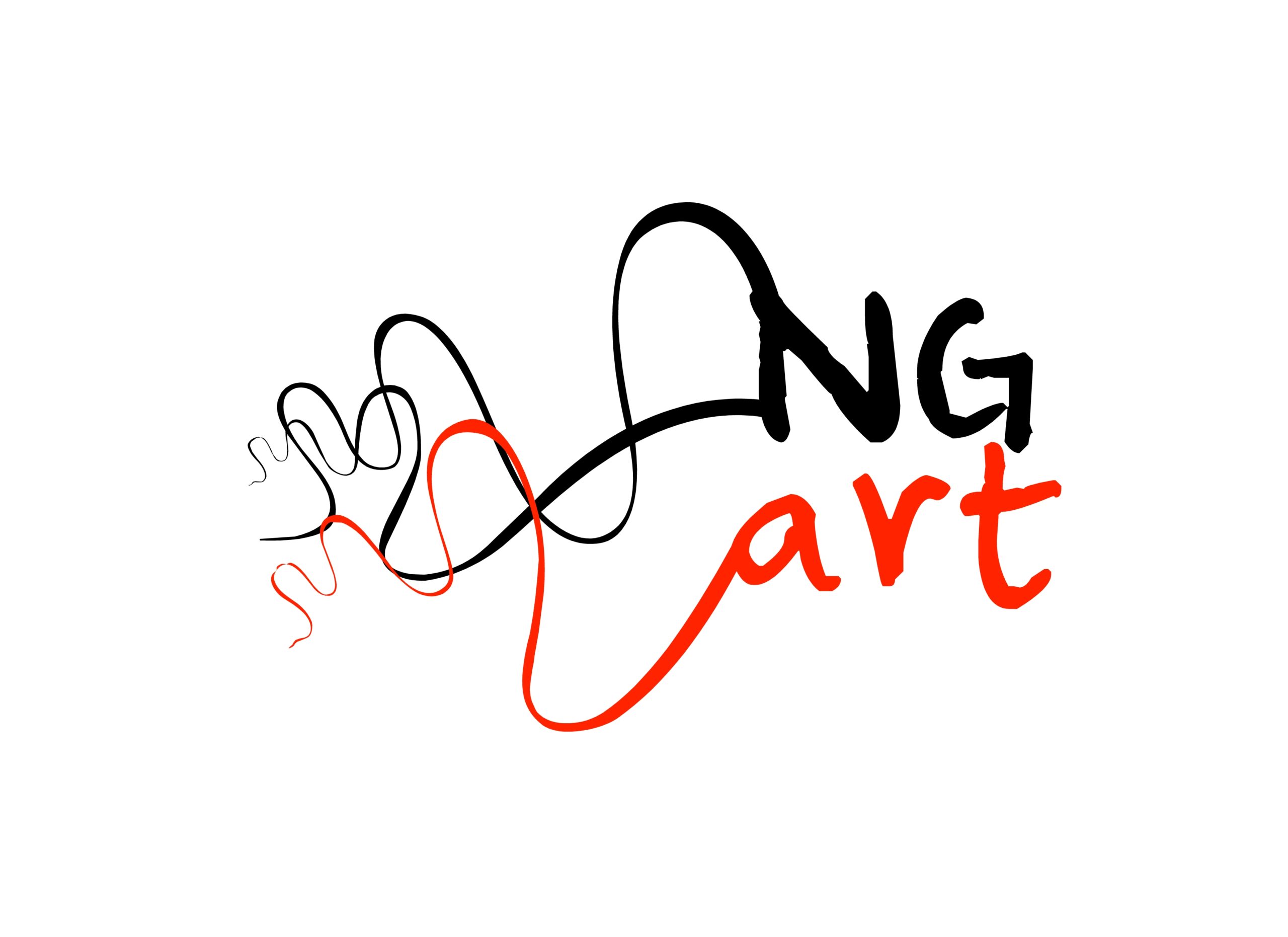
- NikArt | After seven years, art section has officially been returned. You can expect to see this logo on creations like Project BlackOut - 2023
During all these years, a lot of bad designs were made indeed, yet I have kept all of them as a reminder to myself that I always have to keep going and make improvements. I should note that although I've worked on some logo design projects, I'm not a professional logo and brand identity designer; hence these logos are only made for my own entertainment and also as a watermark for my projects.